Design Number One:

Design Number Two:

Design Number Two:

Gwen Stefani's Magazine Advertisement

Gwen Stefani's Album Cover

Marina and the diamonds The Family Jewels Album

The Family Jewels Marina & the diamonds Magazine Advertisement
Having begun researching some magazine album adverts I have already noticed the following are typical information found on an album cover:
I composed all the answers I collected for each question and worked on them, making an overal conclusion. Here are the views I gathered for the three questions above,
Candice Modeste: 'This album cover is likeable as it has a simle and appealing design and the album cover is not too crowded. The picture is also attractive and stays in line with the design. Thealbum cover may however prove too simple for some potential buyers who would prefer a 'busier' album cover where there is more to look at. If anything could be changed it would maybe be the background colour or design so that it would strike a happy medium to suit audiences who like both 'simple' and 'busier' looking album covers.'
Roza Zobedey: 'The album cover has a nice unique design with an attractive picture at the centre and simple designs surrounding the central picture. However, it can also be seen to be too simple and plain which some people may find boring, and so to improve I would suggest a change in the background colour, make it brighter with more detailed designs to appeal to a wide range of people'.
Sarah Williams: 'I find this digipak appealing as its simple designs gives the album a simple and elegant outlook. I like the choice of light colours as the album doesn't look too packed. In order to improve this album cover, I beleive a more striking background will enable it to improve the album cover's outlook. Overall, I would purchase this album cover for its simple outlook!'
Liah Campbell: 'The album cover is simple yet it still manages to catch the eye, the picture is pleasant looking and really pulls the entire cover together. The background however, could be a little more interesting to look at in order to engage people and attracts them to it.'
Overall, from the ideas I have collected above, it is obvious the background of the digipak comes across as 'plain'. My initial intention was to choose a white background in order to allow the album cover come across as neat, I was also influenced by Mariah Carey's 'Memoirs from an imperfect angel' album cover. The fact that the digipak is not too crowded was a positive point made by people. I think if I had to create another digipak, I would most deffinately choose a designed background as this seems to be an important and realisable aspect on a digipak.

 Back Cover

Editing on Macromedia Software


 Here, I have made the background of the original picture in one black and the other white. I did this to see which one gave a more professional look, and came to a conclusion the black background did. In order to do this I used Photoshop which I downloaded onto my laptop.
 Evidently I have changed the saturation of both pictures here. I did this in order to make the picture more appealing and attractive to my targeted audience.
 I have made the background to this picture white, giving it a professional look. This has been done for me to keep as a picture which I can use for either my digipak or magazine advert allowing my designs to look proficient.
 Above, I have cropped the original picture and made more of a focus to the face. I have also changed the tone, making it a more vibrant red colour. I have done this as red has many connotations in the genre of 'RnB' therefore if I do intend to use this picture in any of my designs it will be easy for me to explain why I have. The red allows the picture to look more eye-catching and promiscious.
  This picture has been given a "pencil" effect along with a white background. This has been done whilst experimenting with the Photoshop software. I've decided this can be one of the pictures I can use.


 Recording on Garage Band with the iMacs
 We began by adding in the title of our music video. We chose a simple and efficient title where the words and flower design grows onto the page. The use of italic writing follows the conventions of an 'RnB' music video and this is why we have included it in our video.
 Above you can evidently see the green background behind our clips. This is due to us adding in our backing track from iTunes. We are able to view our video now with the music we have made from the Garage Band software.
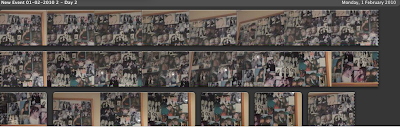
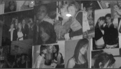
 Here are the extra bits of filming we have included in our video. We filmed pictures from the main characters bedroom in order to reflect her happy times she has had over the year with her friends. We changed the colour settings of the clip to black and white as this mirrors the characters feelings at this point of the video, it is not until the very end where there is a colour clip reflecting her mood.

