Sunday, 28 February 2010

Beginning Ideas For Magazine Advertisement

After commencing on some relevant research, I have put together a few of my ideas for my magazine advertisment and made two designs. I intend to work on these designs, improving them and creating them on a photoshop software. These are not my final designs, but my starting point to this ancillary task. Here are the designs:
Design Number One:

Design Number Two:

Saturday, 27 February 2010

Gwen Stefani Magazine Album Advert Analysis

I have analysed the magazine advert for Gwen Stefani's 'Love Angel Music Baby'. This has enabled me to come up with a few ideas of my own as I have noticed several similarities with the album cover and advertisement.


Gwen Stefani's Magazine Advertisement


Gwen Stefani's Album Cover


Analysis of 'The Family Jewels Marina & The Diamonds'

I have decided to analyse this magazine album advert in order to gain ideas when commencing my very own design. I found different typical features of a magazine album advert when studying this specific ad. One of my main findings was the similarity with the albm cover and the advertisement. This can be said to create a specific identity for audience and readers to relate to.

Marina and the diamonds The Family Jewels Album

The Family Jewels Marina & the diamonds Magazine Advertisement

Ancillary Task Two - Magazine Advertisement

Ancillary Task Two: to design a magazine advertisement for your digipak

As our second task, we have been told to design a magazine advert demonstrating a clear relationship with our digipak. In order to achieve this task we have to do the following:

  • Research - look at designs, colours, images, font types, layouts, mise-en-scene and texture used in other magazine adverts from our genre to help begin our designing.

  • Use similar, if not the same design colours, images, font types, layout, mise-en-scene and texture in our magazine advert as previously designed in our digipak.

  • Be able to successfully show coherent links between our digipak and magazine advert and our music video and at the same time create a professional and realistic look.


Having begun researching some magazine album adverts I have already noticed the following are typical information found on an album cover:

  • Artist's name and album title
  • Websites are included
  • Tour dates
  • Outlets in which the album is available at
  • Slogan/tagline
  • Product content
  • Name of record label

Wednesday, 24 February 2010

What have you learnt from your audience feedback from your overall Digipak?

After the completion of any new product, it is vital to collect audience feedback as this permits you to bring ideas together. In order to do this, I put together a questionnaire and handed this out to a group of people via Facebook. These are the three questions I asked,

  • What characteristics do you like best about the digipak?
  • What characterisitcs do you not like about the digipak?
  • How would you improve this digipak?And why would you improve this?

I composed all the answers I collected for each question and worked on them, making an overal conclusion. Here are the views I gathered for the three questions above,

Candice Modeste: 'This album cover is likeable as it has a simle and appealing design and the album cover is not too crowded. The picture is also attractive and stays in line with the design. Thealbum cover may however prove too simple for some potential buyers who would prefer a 'busier' album cover where there is more to look at. If anything could be changed it would maybe be the background colour or design so that it would strike a happy medium to suit audiences who like both 'simple' and 'busier' looking album covers.'

Roza Zobedey: 'The album cover has a nice unique design with an attractive picture at the centre and simple designs surrounding the central picture. However, it can also be seen to be too simple and plain which some people may find boring, and so to improve I would suggest a change in the background colour, make it brighter with more detailed designs to appeal to a wide range of people'.

Sarah Williams: 'I find this digipak appealing as its simple designs gives the album a simple and elegant outlook. I like the choice of light colours as the album doesn't look too packed. In order to improve this album cover, I beleive a more striking background will enable it to improve the album cover's outlook. Overall, I would purchase this album cover for its simple outlook!'

Liah Campbell: 'The album cover is simple yet it still manages to catch the eye, the picture is pleasant looking and really pulls the entire cover together. The background however, could be a little more interesting to look at in order to engage people and attracts them to it.'

Overall, from the ideas I have collected above, it is obvious the background of the digipak comes across as 'plain'. My initial intention was to choose a white background in order to allow the album cover come across as neat, I was also influenced by Mariah Carey's 'Memoirs from an imperfect angel' album cover. The fact that the digipak is not too crowded was a positive point made by people. I think if I had to create another digipak, I would most deffinately choose a designed background as this seems to be an important and realisable aspect on a digipak.

Tuesday, 23 February 2010

In what ways does your music video and digipak use, develop or challenge forms and conventions of real media products?

Before commencing on our music video we had to do some thorough research into our chosen genre. I watched several different 'RnB' music videos, and compared the similar features. Researching typical conventions of an 'RnB' music video allowed me to gain a clear understanding of what exactly is required. When beginning our storyboard, we tried to embed similar shots that are used in 'RnB' music videos, and most of all a typical storyline in order to follow the conventions. This was all successfully acheived, as we were able to depict what we wanted to represent in our videos. Aspects of our music video evidently challenge the conventions of a archetypal 'RnB' video. We present a typical storyline but different to that of todays 'RnB' music videos, as we do not put across half naked women or film in a grand mansion. This does not mean to say we challenge the genre throughout our music video, features of our video do use the conventions of an 'RnB' video. This is seen through the choice of shots, the storyline and the use of technology e.g. latest mobile phone.

When beginning the ancillary task for our very own design of a digipak, I also carried out some research on 'RnB' digipaks. This aided me to get ideas when developing the design of my digipak as I was influenced by different digipaks. It can be argued the design of my digipak challenges the conventions of 'RnB', as most female artist tend to use a picture which is revealing to audience. However, I have not used an image likewise, but one where a female is covered up when compared to Rihanna, Beyonce or Mariah's album covers. The font choice develops the conventions of an 'RnB' album cover. Many female 'RnB' artist today typically portray their names in italic on their album covers to depict their feminine side and therefore I have followed this convention and developed it into my own digipak design.

Final Album Cover


Front Cover

Back Cover


Spine of album cover

After several attempts on various programmes including Macromedia, Photoshop and Paint I have decided on my final album cover. I have chosen to use this album cover as my final piece, as I feel it is the best design. The use of butterflies on the front and back album cover expresses the feminine feel to the album. It also corresponds to the love songs in the album. In our music video, we see our main character Sarah towards the end of the video moving on, therefore it can be said the butterflies represent Sarah as they spread their wings and fly away, hence moving on. The choice of gold ontop of a white background was from the influence of Mariah Carey's album, "Memoirs of an imperfect angel". I feel in comparison to my black and gold design, the white and gold allows the album to gain a more effective look, permitting the album to obtain a wide range of an audience. The italic writing is a typical convention from the 'RnB' genre, and therefore I have embedded this into my album cover design. Evidently, the italic writing also allows the album to have a feminine outlook, and it is for this reason why many 'RnB' albums choose to use an italic font in order to depict the feminine artist. The italic writing can be said to give the album a more natural look and I have also used this as many people preferred an italic font when I carried out my questionnaire. I have chosen to use this picture on my album cover as she looks directly at you, engaging a wide range of an audience. This effective looks makes the album cover feel more personal and allows the audience to feel as though they have a connection with the artist.

Sunday, 21 February 2010

Working on My Album Cover

With the use of the Macromedia software I have been able to work on editing my pictures for my final album cover. The software has allowed me to place pictures on top of pictures without any evident errors. Macromedia has also permitted me to gain ideas as it provides you with a variety of different layouts/designs. This helped me to come up with different background designs during the first stages of beginning my design. With the different amount of editing techniques equipped onto the software I have not struggled in designing my album cover as it is a very complexed software, easy to work with and understand.

Editing on Macromedia Software

Saturday, 13 February 2010

Album Cover Attempt 3


Above is another design of my digipak. However, I am not 100% happy with it. I feel there can be a lot done to this album cover as it still looks quite unfinished. I am pleased with the way the picture fits in with the background as the uneven bits are made hidden. Though I think the background looks somewhat plain and too simple as it looks like it would help with a design placed onto it. I intend to work on this album cover even more and maybe start a new design with a more exciting and eye catching background.

Pictures For Album Cover & Magazine Advert

I have chosen to use the following pictures for my digipak design and magazine design as they fit into the conventions of 'RnB'. There are several different shots here for me to choose and work from, some being medium shots, long shots and close-up shots. I have began to edit a few of the pictures in preparation for the design of my digipak.

Here, I have made the background of the original picture in one black and the other white. I did this to see which one gave a more professional look, and came to a conclusion the black background did. In order to do this I used Photoshop which I downloaded onto my laptop.


Evidently I have changed the saturation of both pictures here. I did this in order to make the picture more appealing and attractive to my targeted audience.

I have made the background to this picture white, giving it a professional look. This has been done for me to keep as a picture which I can use for either my digipak or magazine advert allowing my designs to look proficient.

Above, I have cropped the original picture and made more of a focus to the face. I have also changed the tone, making it a more vibrant red colour. I have done this as red has many connotations in the genre of 'RnB' therefore if I do intend to use this picture in any of my designs it will be easy for me to explain why I have. The red allows the picture to look more eye-catching and promiscious.


This picture has been given a "pencil" effect along with a white background. This has been done whilst experimenting with the Photoshop software. I've decided this can be one of the pictures I can use.


  • Other pictures which I have not yet worked on but intend to use for my designs are:


Friday, 5 February 2010

Editing


After hours of researching the net, asking people how to join clips and spending time trying to join our clips we decided we would give up on joining them as we did not successfully find out how to do this on the iMovie. Therefore, we concluded with adding in transitions between the clips making the noticeable jump not so obvious. After clicking on "set themes" on the transition section me and Sarah discovered a "photo album" theme which we thought would be relevant to our music video. After adding in the transition, our music video began to look more like a video with different 'RnB' conventions. Once we watched our music video, making sure the "photo album" we had added in flowed well we realised the jumping clips no longer jumped as the application allowed the clips to flow. Below are pictures of how the application has changed our music video.


Monday, 1 February 2010

Recording

Previously, we attempted to record the lyrics to our song however, we faced some difficulty producing a clear recording. Due to background noise we decided to record the lyrics for the second time onto the iMacs. Today at lunchtime we was able to record over our track we created from Garage Band. At first we noticed a tapping sound whilst recording which caused a problem once we played our recording. After minutes of playing around with the iMac we realised the tapping sound came from the Garage Band software. We had our Garage Band recording software set on "Female Vocal" which was causing the tapping sound as once we deleted this effect we succussfully recorded our song. Now we just need to add the recording onto our music video on iMovie!
Recording on Garage Band with the iMacs
Editing

In todays lesson me and my peers worked on editing our video. After previous sessions on editing, we found the opening of our video too continious. Therefore, in order for the beginning to not look or feel incessant we filmed extra bits to add in at the start of our video.

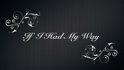
We began by adding in the title of our music video. We chose a simple and efficient title where the words and flower design grows onto the page. The use of italic writing follows the conventions of an 'RnB' music video and this is why we have included it in our video.
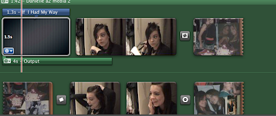
Above you can evidently see the green background behind our clips. This is due to us adding in our backing track from iTunes. We are able to view our video now with the music we have made from the Garage Band software.
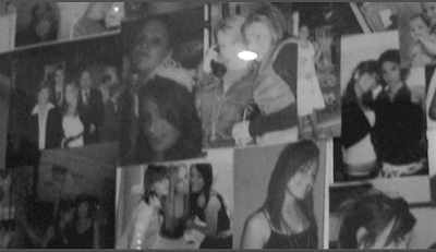
Here are the extra bits of filming we have included in our video. We filmed pictures from the main characters bedroom in order to reflect her happy times she has had over the year with her friends. We changed the colour settings of the clip to black and white as this mirrors the characters feelings at this point of the video, it is not until the very end where there is a colour clip reflecting her mood.